Critiquing the Letterboxd Web App
|
5 minute read
Letterboxd is a popular movie tracking platform that combines discovery and social features while rejecting aggressive growth tactics. As an avid user, I found that the app often presents the artifact without the context: a review without who engaged with it, a film without who wants to see it, a member without their taste. In this post I will analyze where this pattern surfaces and walk through potential fixes, along with pain points I ran into across core flows.
Hidden Social Signals - What Are My Friends Up To?
One issue with the friends activity sections is that it’s hiding a lot of information, defeating the purpose of the intended social features. For example, the New From Friends section shows that a friend has logged, rated, or reviewed a movie. However, it doesn’t show films they’ve added to their watchlist, lists they’ve made, reviews they’ve liked, or replies to reviews they’ve written. I would modify this section to show a preview of all friends activity.
And then in the Popular With Friends section, I’d list the friends that each movie is popular with and show why these films are showing up here. For example, if multiple friends have added a movie to their watchlist recently. Without this context, it’s not clear who is interested in these films or why.
I’d also remove the H1 welcome message on the homepage as the content is a mix of friend activity and various website content, and because it takes up a chunk of space without adding much value.
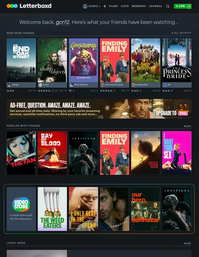
To see a full list of friend activity, you can either click on the All Activity link in the New From Friends section or this lightning bolt icon in the navbar. A lightning bolt doesn’t naturally communicate friend activity so visitors won’t initially know where this link takes them to. The use of the icon also sidelines this important page, compared to the other navbar links. To make it more prominent I’d remove the icon and instead label it as Activity. To make up for the added space, I’d then remove the Journal link.

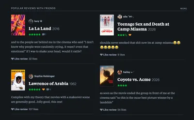
The homepage has a Popular Reviews with Friends section, which is convenient to have. However, it simply displays the reviews, omitting which friends interacted with these reviews and whether they replied or liked it. This removes the connection and context a visitor has with these reviews and requires them to click into them to find this information.
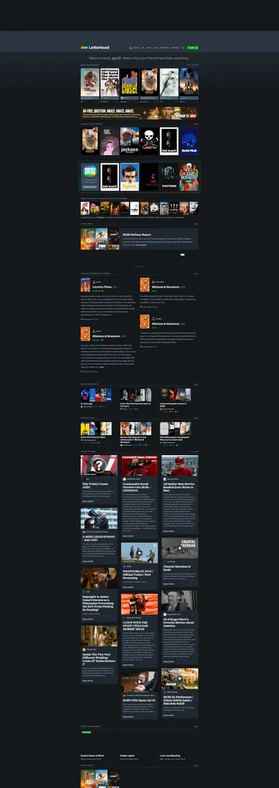
Towards the bottom of the homepage is a section featuring external stories. I agree with the placement, but the issue is that they take up around 1/3 of the entire page. Stories aren’t what Letterboxd is known for and would therefore be better suited as a smaller section that links out to the full collection.
Searching for Movies
Finding movies should be one of the easiest flows on the site. However, there are pain points and inconsistencies.
The first is that the navbar search input doesn’t contain any autocomplete based on what the visitor has typed. Instead, they have to hit the Enter key and be brought to a search results page (more on that later).
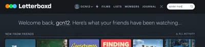
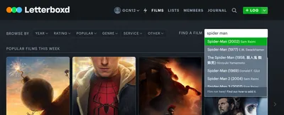
The search input on the Films page has the opposite behavior as the one in the navbar. It lists suggestions based on input, but requires a visitor to select one of the options. There is no way to get to the full search results page. This is an issue because the results only show the title, year, and director, but that is not always enough for someone to identify the film. My suggested solution here is to display the search suggestions in both inputs but also allow the visitor to go to the full results page.
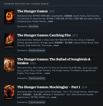
The movie search results page displays a list of alternative titles for each film, which is unneeded for the average visitor and takes up the bulk of the space. Instead, presenting the main actors and a short description of the movie would aid in identifying the movie. The alternative titles list would be better suited to the film details page.
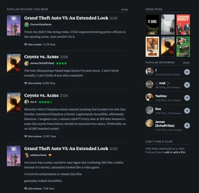
On the Films page, there is a sidebar card prompting the visitor to contact Letterboxd if the movie they’re looking for isn’t found. This is misplaced because this page is about showing recent or popular movies. A visitor would not arrive at this CTA after performing an exhaustive search. A better spot for this would be on the search results page sidebar.
Adding Content - Let’s not jump through hoops
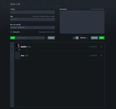
The page for creating lists comes across as unrefined due to inconsistent styling and layout.
Starting with the title field label, there is a green dot next to it, for no apparent reason.
In the tag input section, hitting Tab and Enter perform the same actions so it’s not clear what the difference is meant to be. Similarly, it’s not explained what the tags are for or what they do.
The “Show position for each film.” helper text is isolated from the “Ranked list” label. This was likely done to be consistent with the helper text in the Tags section, but here it creates a void between the checkbox label and helper text.
The label for adding a film is enclosed within the primary green color, even though it’s not a button. The label and input placeholder text also omit the words “film” or “title”, making it less clear that this is how you add movies.
In terms of layout, the Save and Cancel buttons are misplaced since they’re in the middle of the page and also next to the table filters. Moving the buttons to either the top or bottom of the page would make them read as the final or over-arching action.
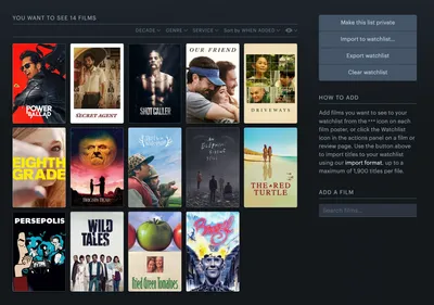
Adding films to a watchlist shouldn’t require a block of text to explain. This is a sign that the process is too complicated or difficult for someone to figure out. It also fails to acknowledge the “Add a Film” input right below.
Banner Ads - How to prevent customers from giving you money
Loyal Letterboxd fans are more than willing to pay to support the site, while also receiving exclusive features. However, the site makes upgrading more like a game of I Spy.
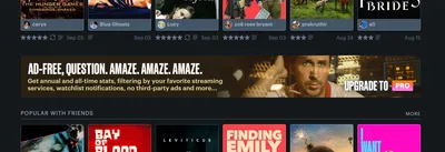
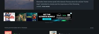
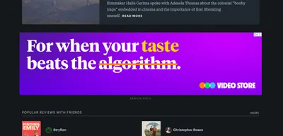
The most apparent issue is that the main upgrade CTA is a banner with a movie still. It looks exactly like the other banner ads on the site, which also often contain movie stills. This leads to the upgrade banner looking like a third-party ad and causes banner blindness, which is when a visitor ignores ads by default.
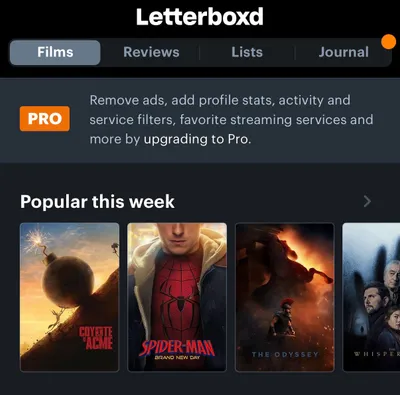
The mobile app handles the upgrade path more pragmatically, by utilizing the same design system as the rest of the platform and by succinctly listing the benefits.
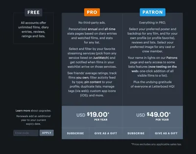
The low hanging fruit of the pricing page is the lack of a primary CTA. As subscribing is going to be the most common path, it should receive a green background color, which is consistent with primary CTAs on other pages. Another easy improvement to make is in the plan benefits section. Right now they’re blocks of centered text, which takes effort to read through. Shorter, left aligned text would reduce the reading tax and make the benefits more clear.
The bigger issue is that the bottom of the Free plan column is displaying three unrelated elements. Ideally, everything in this column should be related to what is included for free and the discount input should be further in the flow, once someone is at the payment step.
Gift Store - Wait, you’re not an Instagram influencer
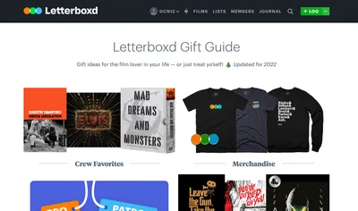
Hidden in the footer of the site is a link to the Gift Store. This is great because it sells company merchandise and strengthens the brand. However, this is diluted by the other gift sections, which often link out to Amazon wish lists. The products themselves are movie-related but feel opposite to the site’s core mission of creating a high quality experience. The lists have also not been updated in years, which leads to the site feeling neglected.

Video Store - A haystack with no needle
The Video Store is a stellar product idea. It makes hard-to-find and lesser known movies available for visitors so that they get to watch a wider variety of films while supporting Letterboxd. However, the Video Store doesn’t live up to the stated goal of film discoverability.
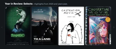
The main issue is that films are organized by pre-defined categories such as “Linklater Curates” or “Lost and Found”. Outside of these categories, renters have to view all titles, which is simply a long list with no search or filtering functionality.
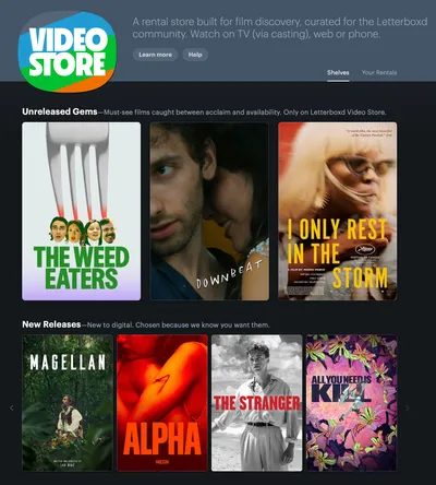
The Video Store also suffers from a missing affordance on each category section. The only way to view all films is to click on the category name, but there is no way to know this without hovering.
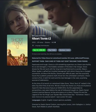
The film details page does little to convince renters to make a purchase. The main deficiency here is information hierarchy. The film tagline is the same font weight and size as the Kit Lazer member shoutout, but in all caps. The member mention should also get a special tag somewhere else on the page rather than being appended to the movie description.
The body text also mixes the movie synopsis with an editorial write-up, which leads to a long block of unstyled text. Similarly, the languages and list are tacked on to the end, which leads to four distinct elements all looking the same.
Members Page - Who are these people?
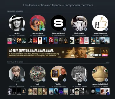
This page highlights top and popular members to make it easy to find and follow people. The idea is there, but it’s hindered by a few design decisions. The most crucial being that there is little information for someone to decide whether or not to follow.
The key change would be to surface each member’s movie taste so that visitors can find people who align with them. In order to do this, the profile photo should be less prominent (since these are often of a movie character or cartoon), the four favorite movies should be larger, and recent reviews or ratings should be viewable. This would also be a great page to display the top reviews of the week so that those users are rewarded with visibility.
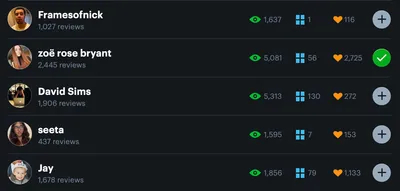
The list of members shares similar problems as the section above. It simply shows a set of stats for each user and presents a button for following them. Despite the added convenience, there isn’t enough information to decide whether or not to follow.
Plan of Action
Here’s how I would approach implementing these changes:
I would prioritize adding social signals, especially to the home page. I wouldn’t be too aggressive about rolling this out, but instead run A/B tests with a subset of users. This is important to start early so that there is time to gather meaningful data.
I’d then remove the upgrade banners and switch them to something that exists within the app design system. To complete this user flow, I’d update the pricing page design and fix the information architecture issues.
Next I’d improve clarity across the site to handle things like the lightning bolt icon, the complicated instructions to add movies to a watchlist, and the Video Store film details page. From there I’d handle the remaining issues.
My findings point to improved social context, a clearer path to the pro plan, and a community that’s easier to find a way into, a boon for both Letterboxd and film lovers.